Tour Guide

Rhythm of Red · In the Name of Writing Color-Ink Series II
徐仲偶 Xu Zhong’ou
Rhythm of Red · In the Name of Writing Color-Ink Series I
Year:
Size:
13.5” x 13.5”
Material:
Sumi ink Calligraphy on rice paper
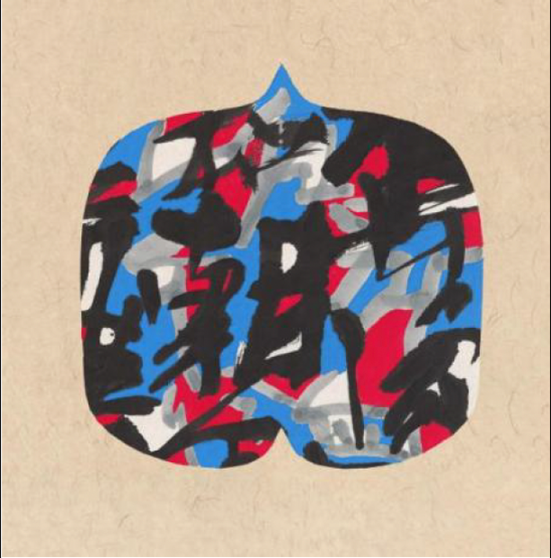
In this work, Xu uses the highly symbolic “Chinese red” to set the emotional tone of the painting. The concentration of red is both an awakening of cultural memory and a focus of the spirit of the times. More than a mere backdrop, it is a spiritual beckoning—a poignant response to over forty years of societal change since the beginning of China’s reform and opening up.
在这件作品中,徐仲偶先生以极具象征意味的“中国红”奠定画面的情绪基调。这抹红,既是文化记忆的唤醒,也是时代精神的聚焦。它在画面中不是简单的铺陈,而是一种精神的召唤,一种对改革开放四十余年社会变迁的深情回应。
A Spatial Symphonyof Blue and Red · In the Name of Writing Color-Ink Series II
徐仲偶 Xu Zhong’ou
A Spatial Symphonyof Blue and Red · In the Name of Writing Color-Ink Series II
Year:
Size:
13.5” x 13.5”
Material:
Sumi ink Calligraphy on rice paper
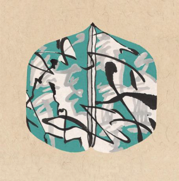
In this piece, blue, as the visual protagonist, constructs the basic spatial structure of the work with its steady and abstruse temperament, while the red adorning its middle beams outward like the energy of a flame—as if passion bursts from a moment of calmness. These two colors echo and interweave with each other in the composition, together creating a spatial interplay of shifting relationships and forming a multidimensional, fluid nonlinear visual form.
在这幅作品中,蓝⾊作为视觉主角,以沉稳、深邃的⽓质构筑起作品的基本空间结构,⽽点缀其中的红⾊,则像⼀束能量的⽕光,在冷静之中注⼊了跳跃与激情。这两种⾊彩在画面中彼此呼应、相互穿插,共同塑造出⼀种空间错动的关系,形成了多维、流动、非线性的视觉构成。
The Dance of Spring · In the Name of Writing Color-Ink Series III
徐仲偶 Xu Zhong’ou
The Dance of Spring · In the Name of Writing Color-Ink Series III
Year:
Size:
13.5” x 13.5”
Material:
Sumi ink Calligraphy on rice paper
This work is dominated by green, blending gray and black lines, unfolding a graceful and rhythmic “dance of lines” onto the paper. Different from the linear rhythm of pen and ink in traditional calligraphy, the lines presented here are free and filled with a sense of movement—a way of writing that “dances” in empty space, inviting the viewer into a visual springtime ballet。
这幅作品以绿⾊为主调,融合了墨灰与⿊⾊线条,在纸上铺陈出⼀场轻盈⽽富有节奏感的“线之舞蹈”。不同于传统书法中的笔墨线性节奏,这里所呈现的线条,是自由⽽充满动感的,是⼀种在空间中“舞动”的书写⽅式,仿佛观者置身于⼀场视觉的春日芭蕾。
In the Name of Writing Color-Ink Series IV
徐仲偶 Xu Zhong’ou
In the Name of Writing Color-Ink Series IV
Year:
Size:
13.5” x 13.5”
Material:
Sumi ink Calligraphy on rice paper
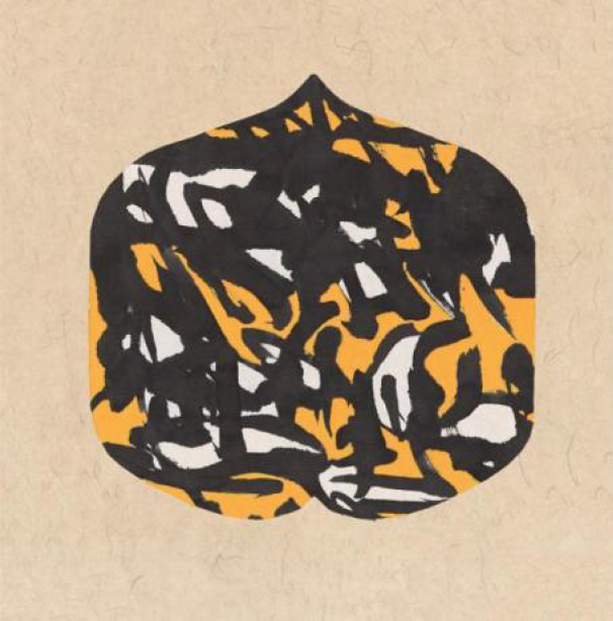
In this work, Xu only uses 3 basic colors—white, yellow and black—to create the visual tension of the entire picture. This extremely simple color language does not pursue stern form, but, rather, it contains his deep ponderances on the nature of color and visual cognition.
在这幅作品中,徐仲偶先⽣仅以三种基本⾊彩——白、黄、⿊——构成了整个画面的视觉张⼒。这种极简的⾊彩语⾔,并非追求形式上的冷峻,⽽是蕴含着他对⾊彩本质与视觉认知的深⼊思考。
In the Name of Writing Color-Ink Series
徐仲偶 Xu Zhong’ou
In the Name of Writing Color-Ink Series
Year:
Size:
13.5” x 13.5”
Size:
13.5” x 13.5”
Material:
Sumi ink Calligraphy on rice paper
Material:
Sumi ink Calligraphy on rice paper
In this work, Xu only uses 3 basic colors—white, yellow and black—to create the visual tension of the entire picture. This extremely simple color language does not pursue stern form, but, rather, it contains his deep ponderances on the nature of color and visual cognition.
在这幅作品中,徐仲偶先⽣仅以三种基本⾊彩——白、黄、⿊——构成了整个画面的视觉张⼒。这种极简的⾊彩语⾔,并非追求形式上的冷峻,⽽是蕴含着他对⾊彩本质与视觉认知的深⼊思考。

In the Name of Writing Color-Ink Series VI
徐仲偶 Xu Zhong’ou
In the Name of Writing Color-Ink Series VI
Year:
Size:
13.5” x 13.5”
Material:
Sumi ink Calligraphy on rice paper
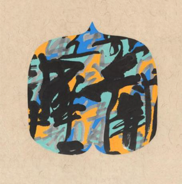
In his In the Name of Writing color-ink series, Xu revitalizes the ancient, introspective Chinese practice of “writing,” transforming it into a visual language charged with the tension of contemporary expression. The works take the form of a“walnut,” symbolizing a vessel of thought and a crystallization of wisdom. Within this form, the fusion of color and ink reflects the artist’s deep reconstruction of the Chinese visual tradition.
在《以书写的名义》彩墨系列中,徐仲偶先⽣将“书写”这⼀古老⽽内敛的中国艺术⾏为,重新激活为⼀种充满当代表达张⼒的视觉语⾔。作品以“核桃”为形,象征思想的包裹体、智慧的结晶;⽽其中所展开的⾊墨交融,则是艺术家对中国视觉传统的⼀次深⼊重构。